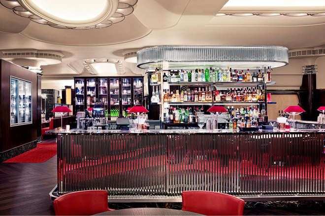
Using inspiration from traditional American steak houses, MASH serves large steaks cut from some of the best cattle in the world. The food is accompanied by an amazing wine list to match the high quality beef, and a design that enhances the experience.
Through MASH’s expertise, ambition, enthusiasm and professionalism, it is keen to be known as one of the world’s best steakhouses and their expansion into London will help to bring the brand to a wider audience.
The London restaurant is being opened within the building of the Regent Palace Hotel near Piccadilly. As a Crown Estate’s building, the whole site has been redeveloped and the art deco 1930s interior painstakingly restored.
Following MASH securing the lease in early spring 2012, architect Herbert and Duncalf Design commenced full scheme design and put in place a project team. The main contractor on the project is Newman Scott and the project manager is Push Design.
Due to the listed status of the building, everyone involved on the project has worked hard to create a space which is sympathetic to the listed interior.
Michael Duncalf of Herbert and Duncalf Design says: “There were two Listed interiors within the Regents Palace Hotel, one of which was the carvery restaurant, Titanic, designed in the mid-1930s in the art deco style by Oliver Bernard, this interior is the main dining room within MASH.
“As a part of the redevelopment of the site by The Crown Estate and Dixon Jones the Listed interiors were carefully removed, renovated and reinstated under the auspices of Donald Insall Associates. We worked closely with both The Crown Estate and Donald Insall to ensure that our design proposal is sympathetic and in keeping with the Listed elements of the building.”
The restaurant is spread over three floors – with customers entering on Brewer Street before being transported down to the dining room and bar below. In total the restaurant covers 2000m2 and the dining room is 800m2.
Michael says: “In the dining room itself, because we have this amazing Listed interior, the challenge was to communicate the MASH brand language through the design of the furniture. We already had a wide palette of furniture, which we designed for the other MASH restaurants, but for this location we extended the palette and developed the design language to sit within the 30s interior.
In addition to the listed elements, we have designed a number of dramatic new features; the helical stair, an elegant sweeping form which occupies the two storey entrance atrium and is offset by the MASH brand totem and wine wall, the entire entrance experience reflects a more American style of 30’s glamour. On entering the main space, the dramatic chrome- and marble-clad island bar defines the space and is flanked by two impressive meat vitrines.
“Within the dining room we have several wine display rooms, a mixture of table and booth seating, and two private dining rooms.
“Every project is important but it’s great to work on such a high profile restaurant in London. We have been working with the MASH client for about 10 years and we know them very well and are delighted to be working with them on their first venture outside Denmark.”


