The owner of Amsterdam’s Replay cafe approached local designer, concrete, to develop a completely new concept for the site. In addition to a new interior design, the name, menu and graphics were also changed.
The Calf & Bloom cafe is situated on the ground floor of the Kalvertoren shopping centre, connects the end of the Kalverstraat with the Singel canal, by the Bloemenmarkt. The new space replaces the former Replay cafe.
concrete claims that the cafe’s new name, Calf & Bloom, has an international character, while also referring the location of the cafe in Amsterdam in which Calf refers to the Kalverstraat (Dutch for Calf Street), and Bloom to the Bloemenmarkt or flower market.
The location of Calf & Bloom, situated between two streets looking out on the Bloemenmarkt and the existing brick facade on the inside, creates the feeling of a hidden square.
To enhance this feel, a new second outer facade was added that connects the two entrances of the cafe in a winding line. Raw steel frames with light panels and louvers create a dynamic wall that separates the front of house and back of house, and includes a variety of functions by serving as a menu board, newspaper display, and chalkboard.
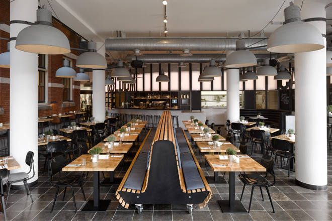
To underline the outside feel, the existing round columns serve as a kind of street lanterns. Large industrial lamps by Frezoli have been attached to the columns and the new facade by means of raw steel brackets. The floor consists of anthracite bluestone tiles. The new facade of louvres and light winds between the two entrances of the cafe. The bar, lounge sofa and high seated tables follow the movement of this facade. The louvres consist of standard raw steel frames divided in four fields of white and raw steel blinds, black chalkboard and light panels.
The chalkboards can be used to announce daily specials or other information. The winding facade also contains doors to the back of house, the kitchen and toilet area. To create a clear contrast, the doors are made of oak blinds. The walls of the kitchen and toilets are covered in metro tiles, which are white in the kitchen and black in the toilets.
The interior is partly characterised by a variety of furniture. The ‘square’ has small French tables with marble tops and wooden bistro chairs as well as a 6m-long cafe bench, high seated tables along the brick wall and an eye-catching round leather sofa.
The oak cafe bench and end grain square tables in the heart of the restaurant can be used for eating or reading. The cafe bench, combined with the revolt chairs, ensure a flexible layout, and in combination with denim pillows, creates a warm ambiance.
The high tables along the brick wall come with comfortable bar stools with saddle leather seats. The saddle leather and brick wall create a raw look, while custom-made reading lamps provide a sense of warmth and intimacy.
In addition to the entrance via the shopping centre, the cafe also has an entrance on the Singel canal where a large terrace can be set up in summer that offers sun throughout the day. The new awning consists of a denim fabric and the terrace chairs are a mixture of indigo and warm greys.
With a new interior came a new name, menu and visual identity. Calf & Bloom is a cafe with an international character. To emphasise this connection it was decided to use a bold font that is held framed by two lines that symbolise the two facades. The bold black on white logo gives the Calf & Bloom identity a contemporary urban atmosphere.
Part of the new facade are two big raw steel logos near both entrances that are integrated into the facade that winds through the cafe. The large logos refer to the advertising light boxes usually used by food chains on shopping streets and emphasise the street-feeling of the cafe.
The graphic design of Calf & Bloom breathes an urban, yet clean atmosphere. The impressive logo on the facade wows the customers but also exudes a clean, recognisable image, which makes each stay at the cafe as comfortable as it should be.
Images © Ewout Huibers for concrete


