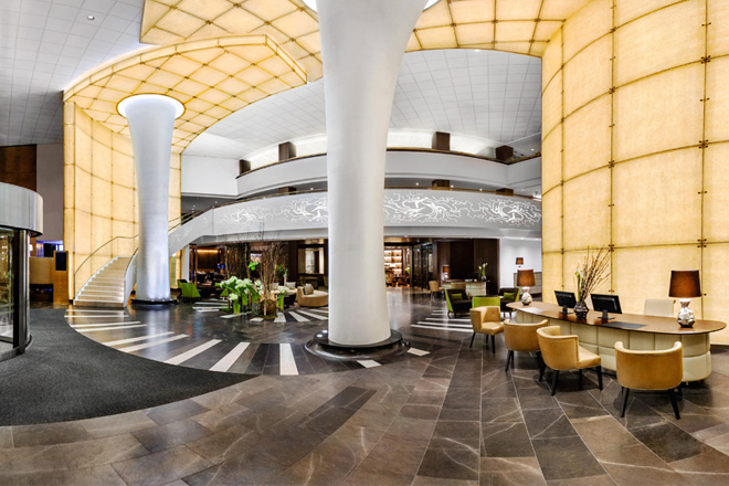
The public areas of the Kempinski Hotel Corvinus Budapest have undergone a transformation by MKV Design. The project marks the hotel’s first major refurbishment since it first opened in 1992. Originally designed by renowned Hungarian architect, Jozsef Finta, and named after Matthias Corvinus – the Renaissance King who established Budapest as a European centre of art and culture – the property was the first internationally-branded hotel to be established in the city after the collapse of the Soviet Bloc.
Over the years, the interiors had come to need new life and distinction in a way that would meet the expectations of luxury hotel guests in the first quarter of the 21st century. MKV Design’s vision for the public areas firmly places the hotel in the present, while enhancing the dramatic scale of the interior.
The lobby’s soaring 9m volume leads up to a glazed roof, amplifying the space’s scale and harmonising the existing shapes and levels. Light shines through the glazed front facade, and the space flows from the main porte-cochere to reception, offering views through the cafe and restaurant to the second entrance on the opposite side of the building.
The two dominant columns have been over-clad and are contained within a back-lit arch which frames the hotel beyond. New elements pick up on the circular glazed roof, such as the patina of the marble flooring, shaping of the portal walls and a circular seating area in the heart of the lobby.
From here, guests catch glimpses of other parts of the ground floor reflected in glass and mirrored panels, designed to play upon their curiosity and draw them further into the hotel.
Reception takes the form of elegant padded leather desks, increased in number from two to four. When the extra desks are not needed, they slide into a full-height timber wall treatment.
Key to the designer’s re-planning of the lobby was the replacement of the staircase leading up to the first-floor function and meeting rooms. A modern interpretation of the conventional grand staircase is now one of the first elements that greets guests upon arrival.
Constructed in an elegant brown stone against a glazed-over Crystalux wall, the staircase’s decorative and perforated metal balustrade – reminiscent of the art nouveau styling for which Budapest is famed – sweeps up and wraps around the first floor where it looks over the lobby atrium.
Blue Fox The Bar – a ground floor bar with its own street entrance – is intimate and clubby in ambiance. The space features dark walnut timber floors and tables, together with richly-toned upholstery to the seating. Lighting is low and discreet, supplemented by the play of reflections from mirrored nooks and columns. The deep glow of the cobalt blue acrylic bar surround, inset with mesh and suggestive of a soda siphon, completes the sophisticated vibe of the space.
Located within the central atrium, The Living Room is a modern interpretation of Budapest’s traditional coffee house culture. The comfortable area marks a quiet contrast to the theatricality of the lobby, where guests are invited to take time out of their day to relax.
A stand-out feature of the space is the new patisserie counter, which is distinguished by a back-lit coloured glass panel. A soft colour palette in shades of orange, pink, yellow and green brings warmth to the space and feminises the rich timber envelope.
The restaurant, renamed ÉS Bisztró, taps into the international trend for creating a dining experience that hints of locale and tradition, yet is firmly rooted in a modern context. It is both farmhouse kitchen and stylish urban restaurant, traditional and modern, a breakfast room and a party venue. Guests can enjoy a contemporary, informal and relaxed experience, reflecting the quality food offering and complementing the hotel’s fine-dining restaurant.
The rustic timber floor features modern tessellated tiles, which define buffet areas. Simple white tiles clad the walls, while the hanging metal ceiling lights are a modern take on traditional central European cafe lighting. The centrepiece bevelled mirror screen – custom-designed in three curved parts – glimpses reflections of people as they pass, while patterned tin ceiling tiles catch a hint of movement below.
The Promenade – a chic and welcoming lounge – is situated in what was previously a circulation space. Seating areas are defined by inset mosaic rugs, which fan out to complement the curve of the space, and lighting is low and atmospheric. The colour palette is natural and timeless, thanks to tan leather sofas; warm walnut panelling to the columns and ceiling; and bronze tables and alcoves clad in honey-toned, deep-stitched Alcantara.
MKV Design’s Maria Vafiadis comments: “Our aim has been to impart a renewed personality to the hotel. By working with the scale and volume of the existing building, it has been possible to celebrate its form while creating spaces that respond to the varying desires of guests through day and evening, on business or at leisure, leaving a unique and lasting impression upon them all.”


