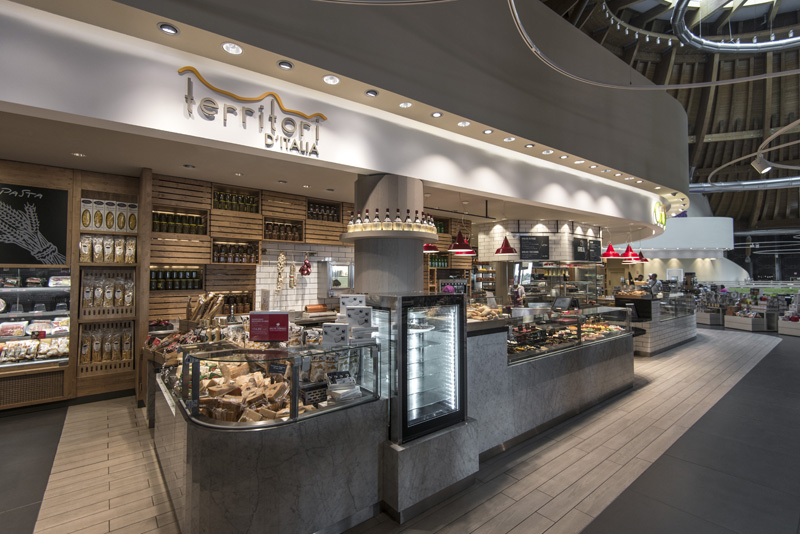
Autogrill, one of the world’s leading provider of food and beverage services for travellers, invited UXUS to develop a new concept for Ciao restaurant in Autogrill’s newest location, Villoresi Est in Milan. Ciao is Autogrill’s most established brand, with an international presence in the United States and Europe.
The new concept breaks away from traditional casual dining formats by offering an explorative and non-linear experience for diners. Refreshing Ciao to a new market-inspired look, the concept is designed to engage all senses and create an exciting stage for fresh food preparation.
Reflecting the Villoresi location’s demographic, the Ciao experience appeals to a wide variety of clients. The customer journey is organised into a series of stations, ranging from delicatessen to grill, salad, desserts and pasta stations.
Each dining offer is paired with a shopping opportunity to complete the experience and reinforce Ciao’s culinary credentials.
Individual food stations feature large display counters, inviting customers to pick their meals and drinks. Each station has an element of exhibition cooking and abundant food merchandising to entice the senses. Whether selecting items mto take-away or sitting down, there is a sense of interaction with the people preparing food just for you.
Packaged food displays are paired with kitchen and restaurant fare to offer clients an intuitive way to further experience the market. A combination of tiered wooden shelves and sculpted stone plays against simple crate-like structures around walls to provide impact and stimulate the eyes.
Linking the adjacent deli shop and Ciao, a traditionally-inspired salumeria, Territori D’Italia, extends into a wine bar with views into the restaurant’s open kitchen. At the front of the bar, a small plates and patisserie station provides service to both seated and walk-up customers, with a dedicated bar inviting clients to enjoy aperitifs before or in between meals.
The materials are chosen to convey the market atmosphere, where abundant food displays provide the central focus. Using wooden crates as a background theme, the natural and grey woods are contrasted with steel and marble counters to create a clean rustic palette. Stainless steel, terracotta brick with black and white metro tiles are used as additional cladding materials to offer a variety of moods within the overall marketplace.
With travellers approaching the site from the single entrance point, the Ciao location is the first thing customers see beyond the welcome desk. The stations instantly establish Ciao as a destination for multiple choices, from quick fresh salads to full course meals and drink pairings, creating a holistic dining offer that appeals to all types of travellers.


