Combining forces with Splendid Restaurants, Shed has created the interior and branding of a new restaurant offer – Cha Chaan Teng.
Occupying a 300 metre square space in the basement of The Club Quarters Hotel in Holborn, London, Cha Chaan Teng is inspired by the café establishments that saw popularity in post-war Hong Kong.
With increased urbanisation and an influx of Western expats during this period, a succession of Cha Chaan Teng cafés emerged to provide locals with access to Western food, which was otherwise only served in expensive hotel restaurants.
“The original Cha Chaan Teng cafés were fast-paced establishments that served up an eclectic, and often unlikely, mix of East meets West food”
The original Cha Chaan Teng cafés were fast-paced establishments that served up an eclectic, and often unlikely, mix of East meets West food. Splendid Restaurants has taken this concept full circle, presenting a British interpretation of an Eastern reinterpretation of Western cuisine.
Shed’s brief was to keep the original Cha Chaan Teng feel, but to upgrade it to suit London’s premium market. Renowned for its brave, statement designs, Shed has created a playful spin on the idea of misinterpretation for the restaurant’s interior.
A broken red and grey logo reading ‘Cha Chaan Teng’ sits above the entrance on Kingsway, Holborn. Not immediately legible, the logo exemplifies this theme of misinterpretation from the outset.
From here, guests enter into a dramatic stairwell with walls covered in a matrix of white, grey and red tiles. Shed has designed a bespoke sculptural light – formed from paper lanterns fused and bound together – which spirals down the staircase, drawing the eye to a striking portrait of a lady. Commissioned from DAIN artist for Cha Chaan Teng, the artwork is printed on wheat paste paper and crudely plastered directly to the tiles.
“Renowned for its brave, statement designs, Shed has created a playful spin on the idea of misinterpretation for the restaurant’s interior”
Black and white in tone, with an overlay of paint drops and neon splattering, she seemingly gazes at guests as they descend to the main dining space.
Here, a maze of services in a pale yellow are smattered across the ceiling, while a grid of small white tiles deck the floor, broken up by random formations of coloured tiles to denote differing areas.
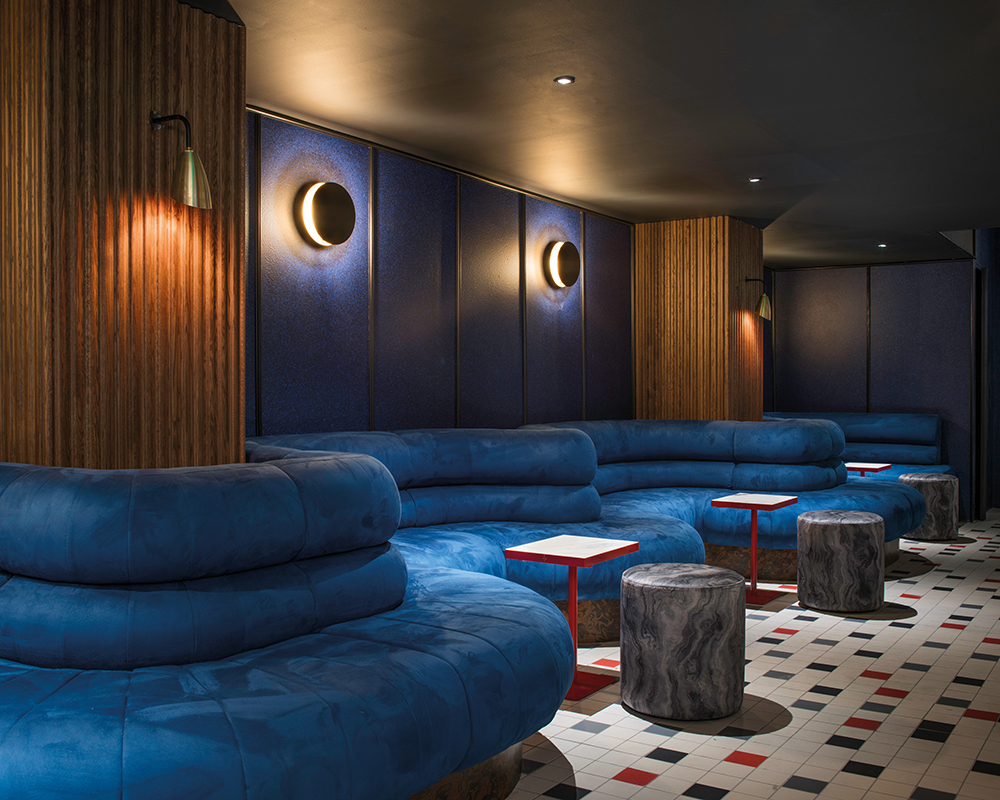
There is a visual divide between the three principal areas of the restaurant: the bar, Bao, and the main dining area. The bar presents a subdued palette of blues, dark greys and burnt pinks offset by dramatic high contrast marbles and swirling timber veneers.
A melange of furniture – art deco in style, but with a mid-century twist – sits in the centre of the space on a silky dark blue carpet, while a voluptuous ink blue suede banquette snakes its way across the floor.
The Bao area, meanwhile, boasts a 2.7m oval crème marble table with amber turntable inserts and copper edging – another of Shed’s bespoke designs. The shared table is accompanied by a number of cushioned stools upholstered in a volcanic marble effect velour. Behind, chefs can be observed working in the small open kitchen.
The main dining area, which offers just over 100 covers, immediately exudes a bustling, energetic atmosphere. In a brave move, Shed has combined high-end materials such as marble and brass, with their faux laminate counterparts. A palette of deep green, dark timbers, off whites, bruised browns and deep purples creates an unconventional yet pleasing aesthetic.
Loose furniture runs down the centre of the restaurant in a haphazard arrangement, verde marble and coloured laminate tables matched with a set of black-framed cantilever- and café-style chairs upholstered in a heavy grain mushroom leatherette.
Elsewhere, a striking marble design has been printed onto fabric panels, which run in repetitions down one side of the restaurant. In front sit a series of deep fluted round banquettes upholstered in a dark racing green leather. Black and silver chip laminate tables have been wrapped with a brass trim, and illuminated by oversized black aluminium pendant lights.
At the far side of the restaurant a large sister artwork to the portrait on the stairwell is audaciously applied to the undulating surface of the wall. The bright colours and bold confrontation of the artwork gives a punch of attitude to a concept already busting with character.


