Hangzhou’s landscape is one of contrasts; on one hand the natural beauty of its UNESCO heritage-listed West Lake and city parks, on the other an ever-expanding urban skyline indicative of the city’s progressive ethos. One of its key developments of late is Raffles City, a mixed-use urban development in Qianjiang New Town. Encompassing two streamlined towers, with a landscaped plaza beneath, the property has become a key landmark along the green axis of Hangzhou’s new central business district.
Expanding its portfolio as a sustainable hub for living, working and leisure, the development is now home to Conrad Hangzhou – a 324-key property designed by AB Concept. For the firm’s founders, Ed Ng and Terence Ngan, the development’s intriguing architecture was a key attraction in taking on the project.
“In 2010, we were invited to design the interiors of the Conrad Hangzhou by the developers, CapitaLand,” they explain. “We were initially attracted to the project by the architect, UNStudio, who was responsible for creating the futuristic high-rise.
“Upon seeing the first renderings, we were completely in awe of the building’s complexity and changing shapes, and ultimately saw it as a fantastic opportunity to work with a world-class architect on their first high-rise hospitality project.”
“Upon seeing the first renderings, we were completely in awe of the building’s complexity and changing shapes”
As UNStudio so masterfully achieved through the development’s architecture, Ed and Terence have embraced Hangzhou’s treasured natural landscape to create a fluid, undulating interior design for the hotel. In doing so, they were also able to accommodate the changing geometries caused by the building’s unique shape, moving away from square corners and static shapes towards sensual, sleek forms. This predominantly emerges through a narrative of ‘tidal rhythms’ that extends throughout the property.
“The whole development of Raffles City has an almost futuristic appeal to it, with flowing lines and sinuous curves evoking the feeling of moving water,” explain Ed and Terence. “The ‘tidal rhythm’ concept was our response to the different forms that water takes in Hangzhou, from West Lake (the body of water around which the city is based), to the Qiantang River, the original lifesource for the area.
“As the lobby is the start of the hotel experience, our design begins with the concept of drops of morning rainfall landing on the lake. By using a curved design, we have translated this repeating, rippling pattern, onto the lobby’s wall facade.
“In the tenth floor lobby, we examined a more serene and reflective form of the water. Using a still and misty morning as our inspiration, our design incorporated the sense of a smooth line meandering through the space.
“In the spa, we took yet another approach to the water, creating a delicate cascade using screens featuring repeating patterns to create the texture of a slow ripple created by the natural movement of water.”
Creating a natural progression from the public spaces, the interiors of Conrad Hangzhou’s three restaurants fous on the culture and people of Hangzhou, living around the West Lake.
Blue Willow, the all-day dining restaurant, was inspired by an iconic scene of the misty lake, with willow trees adorning its banks. The curves of the seating area here have been designed to evoke the feeling of sitting at the edge of the water, whilst patterned pillards create the feeling of falling leaves.
Dashes of blue have been employed throughout the space, not only symbolising water, but also as a tribute to the renowned style of Chinese ceramics known as ‘Blue Willow’.
“At Uka, the hotel’s Japanese restaurant, we worked to create an atmosphere that reflects life in Hangzhou,” add Ed and Terence. “The ceiling light displays a gradient of light when turned on, thus creating a scene much like that of the city lights, appearing through the mist and reflecting on the water.
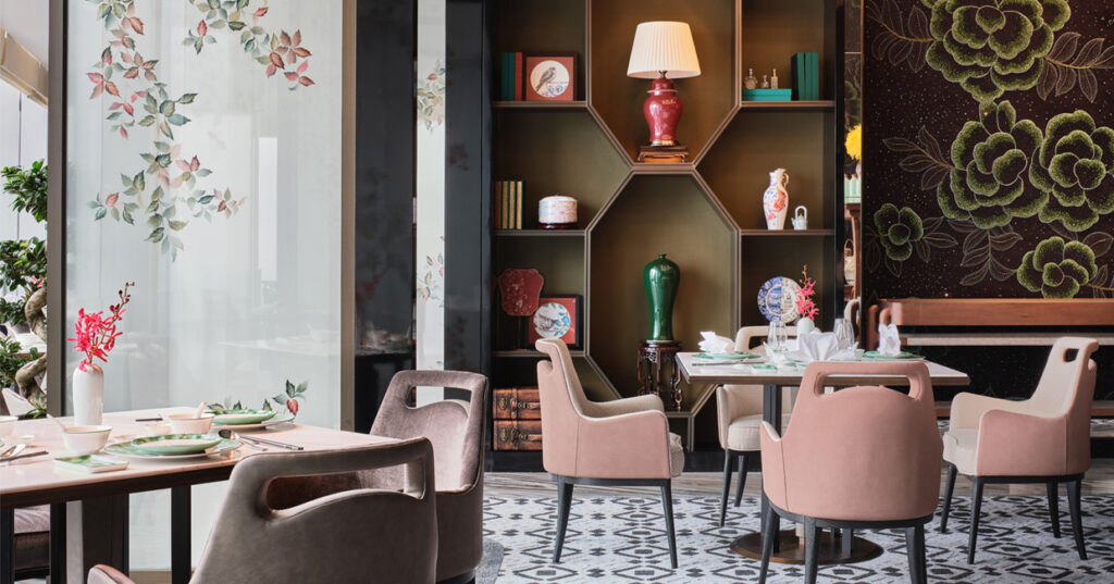
“Lastly, at Li’an, the Chinese restaurant, we used our design concept to narrate a story of a girl who travels from Hangzhou to explore the world, before returning to the city to tell her stories. The restaurant therefore contains decorations from both Eastern and Western cultures, featuring embroideries, ceramics, books, lamps and various other ornaments to evoke the narrative.”
Within the guest accommodation, meanwhile, rooms are divided into four categories – ‘Summer Serenade’, ‘Winter Finale’, ‘Spring Harmonic’ and ‘Autumn Prelude’. Each category has been asigned appropriate colour palettes in accordance with the the theme, chanelling the colour of water from season to season.
AB Concept’s scheme embraces the wider ethos and feel of the Raffles City development, while celebrating the focus on contemporary architecture, luxury travel and individuality that characterises the Conrad brand.
“We focused strongly on form as the major element of expression in the interiors, choosing simple yet elegant materials to build up layers of patterns, ultimately expressing a unified message throughout,” Ed and Terence conclude. “This consistency in line and form is, in itself, quite unique in urban hotels, and thus further links our work to the development of Raffles City.”


