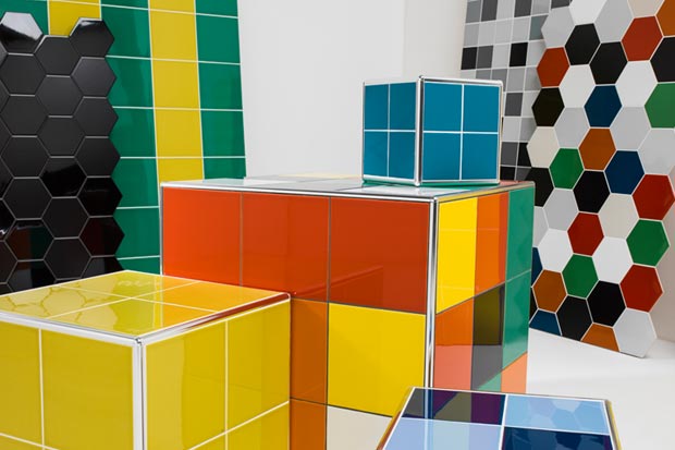
Prismatics by Johnson Tiles offers one of the biggest colour ranges of British-made ceramic wall tiles, with a diverse palette of 68 different gloss and matt shades in five different sizes, including a selection of the new hexagon shapes available in 13 key colours.
New on-trend tones have been added to the range, increasing the number of neutral, dark and warmer shades in co-ordination with existing colours.
To refresh the Prismatics palette, Johnson Tiles collaborated with colour consultant Ptolemy Mann, who worked alongside Johnson Tiles creative director Darren Clanford to build new emphasis on trend-leading shades for the range, such as new addition Blackberry, a rich aubergine tone that coordinates perfectly with other neutrals.
Darren Clanford says: “Refreshing Prismatics – which was first launched over 30 years ago – was a huge undertaking. It was already one of the biggest and most comprehensive plain colour tile ranges available in the UK, our challenge was creating fresh colours that genuinely are new and would enhance the range. Ptolemy Mann, who worked with us at Clerkenwell Design Week to create the Prismatic Landscape colourwall to preview the range, helped us with colour selection. She has been the perfect partner to bring our new collection to life. The aim was to create a modern, balanced range of colours that work individually, mixed in tonal groups or used as an injection of colour alongside neutrals.”
One of the key new offerings is the development of colour graduated, tonal profiles for the refreshed range, making it easier for specifiers to quickly and easily identify complementary shades within the collection.
Ptolemy Mann says: “I’m a big fan of tonal colour – several shades of the same colour together on a wall. By presenting ‘groups’ of colours that co-ordinate, you can choose your own selection from each group. The new Prismatics palette has been arranged in such a way that customers can easily see the different options for tonal colours.
“This is inspired by how they can be used for exciting interiors, for example, ‘warm neutrals’ or ‘cool neutrals’, so greens and blues that could be used together on a wall to create movement and flow. A single-coloured wall can appear static and flat, whereas this use of tonality and gradation of colour creates more interesting texture and depth.”
The new Prismatics range will feature 12 different neutral shades; 11 green tones; 13 blue shades; 15 natural colours; seven different tones of reds, purples and pinks and 10 different grades of yellow and orange.
Sizes within the range include 200x200mm, 150x150mm, 200x100mm and 100x100mm, plus the 150x173mm hexagons and co-ordinating fittings.


