Old cinemas languish awkwardly among the modern urban landscape waiting to be reinvented. So when Flanagan Lawrence was tasked with reimagining a Grade II listed cinema, located on one of London’s busiest streets, naturally Hospitality Interiors sought out project director Jason Flanagan, to show us around the recently-completed transformation.
Dozens of old, unused cinemas still slumber the UK’s in high streets. These once-proud, substantial buildings were designed to be dark inside and relatively few have been successfully re-imagined as hotels. Most have been razed and completely redeveloped or worse, suffered the ignominy of morphing into bingo halls or rather grubby nightclubs. The Pavilion Shepherds Bush is one such successful reinvention.
The Pavilion is a Grade II listed building dating from 1923 and was originally constructed as a cinema. Designed by Frank Verity, it won the RIBA London Street Architecture Award for the best London façade. Following heavy damage from a V1 flying bomb during World War II, the building was poorly repaired, and was then converted to a bingo hall in 1983 – closing its doors for good in 2001, remaining disused for much of the next decade. In 2009, planning permission was granted for conversion into a four-star, 320-room hotel with conference facilities, café, restaurant, bar, retail spaces and a roof-top spa.
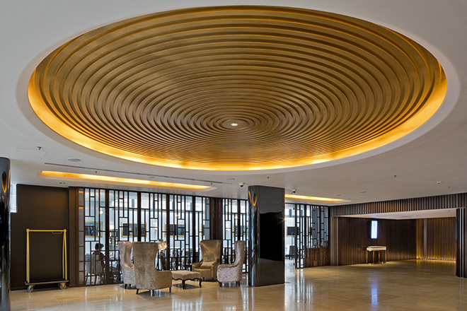
As guests enter via revolving glass door, a golden, domed recess mirrors the impressive archway of the tower sited at one end of the building. In the top of the of the tower are some of the hotel’s best rooms. Passing the reception on the tight, down a couple of full width steps to a lower foyer – whose layout echoes the original cinema foyer including a reference to the original circular floor decoration which marked the centre of the foyer and entrance to the cinema.
Drawing on the influence of Art Deco cinema design, the foyer and atrium spaces employ simple curved surfaces in alternating bands of black and gold. The internally illuminated spandrel panels also minimise sound reverberation. At ground floor level, dark-stained, ribbed timber panelling and heavy curtains serve a similar purpose.
The colour palette is restrained using black, grey, gold, taupe, putty and muted natural tones. Featured finishes include high gloss, various metallics, mirror and polished surfaces to help bounce the light and to continue the deco influence. The beautiful, honey-coloured limestone floor is inlaid with brass, in two simple decorative elements. In the main reception, brass strips form a series of concentric circles at the centre of the space, which are reflected in a ceiling coffer above.
Then the focal point of the hotel is revealed: guests will glance skyward to the glazed roof atop the cigar-shaped atrium which rises the full height of the space helping to introduce much-needed light to the space. Golden bands are formed by the walkways surrounding the atrium which also allows natural daylight into the inner rooms.
Once again, the theme of the golden age of cinema is expressed here with soft golden tones and a darker background and the deft use of sound-absorbing materials where possible on the balconies and wall surfacing to ensure this space is grand yet intimate and any echo is neutralised.
The atrium is the key to this conversion working so well, for without the light well, the reduction in the key numbers would have nullified the commerciality of the project. As it is, Flanagan Lawrence turned a potential pitfall into a stunning centrepiece which makes all the difference to the property as a hotel.
Jason Flanagan, project director at Flanagan Lawrence, says: “Our design has been informed by a detailed understanding of the building’s history and context. Our response complements and refines the original character of the building, protecting this important heritage asset, reactivating the streetscape and providing a new point of focal interest on Shepherds Bush Green.”
The guestroom interior design was expertly handled by Wendy Chiu using a calm and sensitive colour palette which provides a relaxed yet well-tailored ambiance to the varying room sizes. There are highlight wallpapers to walls behind the bed and here the designer is more expressive.
The textures used throughout are muted – grey, putty, white, linen – and the furniture and surfacing is similarly restrained using painted plaster, often with shadow-lines, natural wood, stone and glass. The room designs are naturally more peaceful the dramatic Art Deco public spaces, and perhaps the rooms could have carried the theme a little more confidently. But nonetheless, the rooms are well-conceived and well-executed retreats from the hustle and bustle of the hotel’s busy location.
There is a considerable number of guestroom plans due to the complex nature of the roof structure and the layout of the internal rooms facing in to the atrium. Some of the larger rooms – in the tower and under the curved end of the roof – are very creatively executed with seating areas, hallways, more generous bathrooms and multiple window options. All the bathrooms are generously fitted with high quality fittings throughout.
In conclusion, Flanagan Lawrence’s sensitive conversion of this old cinema has been informed by a detailed understanding of the building’s history and context. The result is a contemporary property that is a balanced composition of old and new elements, both in the facades, but also in the contrast between the inside and outside.


