Aston Design, a multi-award-winning creative studio, introduces the interior design behind the renovation of Machan at the Taj Mahal New Delhi. The restaurant first opened in 1978 and has undergone a stunning transformation, respecting its lengthy heritage while giving it a contemporary update. With the renovation completed in 2020, and the restaurant quietly reopened amidst the Covid-19 pandemic, Aston Design speaks about this project.
David Edwards, Managing Director of Aston Designs, said: “Having enjoyed Machan’s hospitality on many occasions over a long association with Taj Group, I was well aware of the fond place it held in the hearts of locals and visitors alike. It was no surprise that the key requisite in Taj’s brief for its renewal was that, while we were to bring the restaurant unmistakably in to the present, the experience should respect and reflect a sense of its past.
The name ‘Machan’, and it’s Hindi meaning, was highly evocative, and our team took great pleasure in weaving that narrative into every aspect of the design. I’m delighted with the warm reception of the restaurant’s new identity, and the continued patronage of its loyal customers is testament to the success of its new incarnation.”
The colour palette of the restaurant’s new look was inspired by a piece of artwork depicting a Raja and his men in a hunting scene. The hues of jungle greens and browns anchor the scheme, giving it a natural feel. An accent in burnt orange was added, inspired by the houdah that the Raja was perching on in the artwork. The combination of these colours creates a warm and inviting atmosphere that complements the restaurant’s jungle-themed decor.
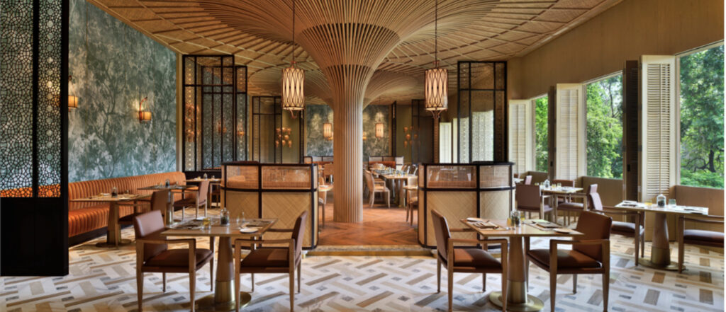
The layout of the restaurant was guided by this principle, with a slightly elevated platform in the centre, symbolically representing a vantage point overlooking the rest of the grounds. The surrounding walls are adorned with custom wallcoverings depicting jungle scenes, featuring camouflaged animals, such as tigers, among the foliage. The murals were a collaborative effort between the Aston Design team and the wall covering manufacturer, Muraspec. One feature that instantly draws the eye are the fluted columns that appear to grow from the floor and curve into the ceiling space, reminiscent of a mature tree reaching for the sky.
The restaurant’s material direction was chosen to align with the jungle-theme, with a natural material palette. The team thoughtfully selected finishes conducive towards the unique operational and maintenance requirements of a 24-hour F&B outlet. A splash of burnt orange colour was added to accent the earth-based colour palette in the seating upholstery. Partitions were introduced to create secluded spaces within the restaurant and inspired by traditional Mughal latticework. The custom furniture styling for Machan’s new interior reflects an outdoor safari look, taking hints of style from the original restaurant but updated to suit modern-day guest expectations. A series of terracotta animal masks were specially created by local artists, reinforcing the Machan story.
“Collaborating with Muraspec’s artwork team and local artists was a challenging but rewarding experience. The custom Machan wallpaper and terracotta animal masks added depth to the space and another layer to the Machan story. It’s amazing how art can be interpreted differently by different people. But the end results were lovely, and we’re proud to have incorporated these unique elements into the design,” said Sandy Kong, Senior Designer at Aston Design and lead designer for Machan.
The Machan Restaurant redesign is a testament to the restaurant’s commitment to providing an exceptional dining experience, and the new interior design is sure to impress guests and cement the restaurant’s reputation as a must-visit destination.
Quick Facts
1. This is the third interior fitout for the restaurant – the original when the restaurant opened with the hotel in 1978, its first renovation at the turn of the century (Machan 2.0), and the current design (Machan 3.0).
2. The current Machan has an increased seating capacity by almost 30% after removing the buffet counters and adjusting the layout. The layout is also adjustable with a flexible private dining are made possible with operable partitions.
3. “What was the single-most-important consideration behind the restaurant design, apart from using natural elements?” To re-tell the machan story, true to its original concept, and to conjure up recollections of the past while creating new memories for guests.
4. “How did you distribute the natural elements throughout the restaurant?” In general, the overall finishes palette gives a light, soothing feel to create a warm, contemporary space, that allows the eyes to focus on the key elements in the restaurant – the tree canopies.
5. “The canopies look very different from actual canopies. What was the idea behind it?” The concept is a tree canopy, not in its literal form but reinterpreted in a stronger architectural vision that will be the key feature in the space.


