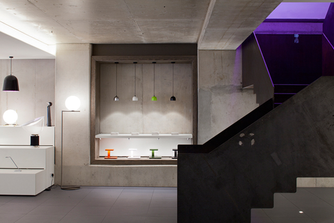
Atrium has now opened its brand new office and showroom space on Leonard Street, London, having previously been situated at St Giles High Street near Tottenham Court Road since 1986.
The new location – which spans 14000 square feet – sees Atrium occupying two floors in an AHMM designed building in the heart of Shoreditch. MD Ulysse Dormoy was keen to move the company to a location that would demonstrate the company’s commitment to design and the sector it operates within.
Atrium commissioned BDP to lead the design for the interiors, mechanical/electrical services, as well as the lighting scheme – their brief being to create a space able to accommodate over 40 staff and associated facilities such as a staff kitchen and client meeting spaces, as well as to house the breadth of lighting products and solutions supplied by Atrium.
Alongside the day-to-day activities, the showroom will also be used for a number of events and functions, so BDP was charged with creating a bar area for entertaining and a 50-seat seminar space used for talks and presentations.
The original space, designed by AHMM, lent itself well to the showroom design. Double height areas at both the front and rear of the building became useful for showcasing some of the Flos’ larger lighting pieces and pendants. Much of the interior makes use of exposed raw concrete walls and columns which BDP decided to retain in the showroom and office design.
Small details such as pencil marks and scribbles made by the builders have also been kept, adding character to the overall design of the showroom. The resulting design is a juxtaposed mix of raw materials and sleek finishes and furniture, which work together to celebrate the range of lighting Atrium has on offer.
The office and meeting spaces occupy the ground floor of the building. Here the design team was led by the function of each space. Open plan work areas are lit by Super Flat, Light Cut, Light Channel, whilst the meeting rooms display dramatic suspended luminaires, such as the Sky Garden by Marcel Wanders and colour-changing soft architecture fittings to create ambiance.
BDP selected Vorwerk’s new carpet tile for the office flooring, which uses a kite shape rather than the conventional square. The team used various colours to create a number of patterns on the floor, with colours converging and becoming more intense within the meeting rooms.
Atrium is the sole distributor for iconic Italian lighting brand, Flos, as well as German-based LTS and the Belgian lighting brand, Modular. With this in mind BDP set about creating areas to display and celebrate the various capabilities and aesthetics of the lighting from each brand.
Set on the lower ground floor, the showroom space houses the full range of Flos’ decorative lighting collection against an impressive ‘show wall’. BDP’s Luke Smith Wightman led the lighting design, and also chose to create a series of ceiling rafts, which allow a subtle grouping of each brand’s product and also hold space for new products to be added.
The architectural ranges in particular allowed BDP to play with form to utilise them to their best. ‘Light Cut’, a zig-zag colour variable slot from Flos, runs through the office ceiling in close coordination with the Super Flat pendants and aircon diffusers.
Flos’ ‘Running Magnet’ leads visitors from the reception space into the main office. Changing direction four times over two walls and the ceiling, it houses spotlights and bright strips wherever light is needed.
The ‘LED Squad’ from Flos is organised under shelves and used as un uplight around the ceiling rafts. This simple variation in application demonstrates the versatility of the product.
Elswhere, dramatic lighting such as Thierry Dreyfus’ Wall Rupture, a striking sculptural luminaire which appears as a fissure within the wall, and Ron Gilad’s Wall Piercing, are used in the reception area to create a bold entrance for visitors to the space.
The showroom also plays host to a unique ‘light room’, a bare space which will be used to help develop and define a client’s specific lighting requirements. Other standout design details include the dramatic staircase from the ground floor to the shwroom, using a solid 10mm steel plate. The team originally planned to paint this, but felt the resulting rusty finish worked well alongside the other materials.


