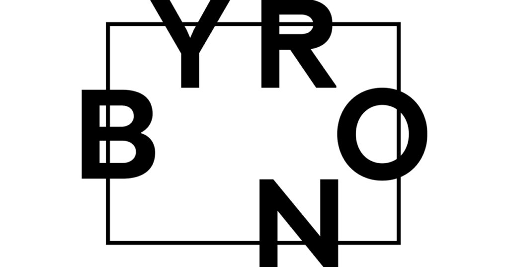
Byron has revealed its new logo, which forms part of a wider redesign rolling out across the brand’s digital platforms and within its restaurants later this year.
A symbol of bigger things to come, the logo is a visual representation of Byron’s new rallying cry – ‘All Hail The Table’.
With the latest Wellbeing Index suggesting a third of British adults are eating alone ‘most or all of the time’, Byron are on a mission to bring people back around the table where, in their opinion, all the best things happen.
According to the Index, eating alone has a negative impact on people’s reported wellbeing levels, and this is something Byron are eager to tackle. All Hail The Table means reconnecting friends, family, colleagues and acquaintances, so they can share stories and have conversations over good food.
The new logo, which has been created using Nimbus Condensed Black typeface, sees the Byron letters representing 5 guests at the table, which can be arranged in a combination of seating styles. The logo has been designed using a primary colour palette of black text against a white background, and is interchangeable with a black text on Pantone 7417c version.
Byron also have a GIF ideation of the new logo, which sees each letter come to take its place at the table from the outer edges of the frame.


