SpaceInvader has completed the transformation of a formerly under-used restaurant at luxury boutique hotel and spa Lanelay Hall in South Wales, creating in its place a vibrant, exciting, new offer, offering a fine dining menu based on seasonal British produce.
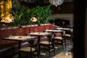
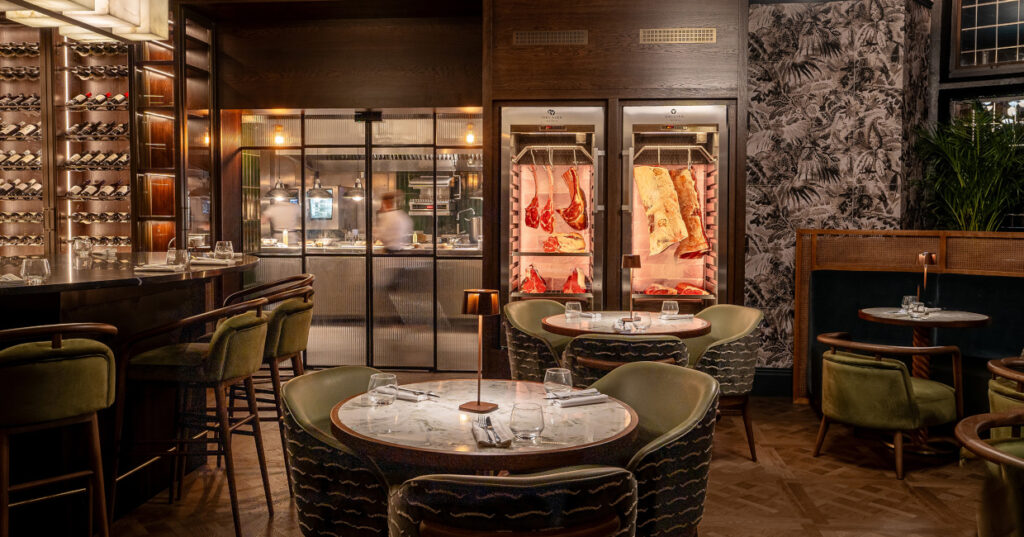
The restaurant has been re-branded as BLOK and features a new interior with an open, theatrical kitchen and a rich, textured and layered treatment. Stand-out features include a new, modular, central booth area and a botanical theme including generous indoor planting and a warm and natural palette. The restaurant also boasts an upgraded and exclusive private dining space and two new, full-height glass showcases displaying wine and curing / ageing meats.
 Background
SpaceInvader Associate Imogen Woodage explained that the existing hotel restaurant space was looking a little tired when SpaceInvader first came on board: “The space was fairly old-fashioned and formal and, with its feeling of spaciousness and very high ceilings, combined with loose furniture throughout, wasn’t attracting potential diners looking to experience an intimate environment. There was clearly a major revenue stream not being maximised here and we were delighted to be tasked with injecting colour, atmosphere, a sense of scale and theatre into the space. The restaurant’s generous proportions meant it had plenty of potential to become not only a surefire winner for residential guests but able to attract local diners as a destination venue in the area.”
The Brief
The brief was clear: to transform the 134 sq m restaurant completely, with a new menu at the heart of the new vision. The new concept needed to make better use of the space and create visual interest through scale, texture, fabrics and lighting to ensure a new sense of intimacy for diners. The brief also covered the restaurant’s private dining area, which needed to attract special occasion diners, but also offer some flexibility to the hotel’s owners to allow overflow from the main restaurant space in particularly busy periods.
 The Approach
“The restaurant featured listed 3m-high, Georgian oak panelling throughout, which we obviously couldn’t touch and so we set about thinking how to transform and elevate the space into a more memorable, contemporary and dynamic offer, working with and not against this beautiful expanse of wood,” Imogen Woodage added. “The client was very open to the restaurant having its own identity, separate from the main hotel, although also harmonious with it, which was great.”
The restaurant’s beautiful period ceiling with its fantastically-detailed feature cornicing was retained and enhanced, repainted in a warm cream, with wallpaper used above the walls and for border areas where the wall isn’t panelled. New flooring throughout is a herringbone timber LVT, the Versailles Dijon from PlusFloor, to maintain the heritage feel of the space and work well with the timber panelling on the walls. New fabrics in the scheme include solid–colour ribbed fabrics which follow a linear theme, referencing the Georgian period, when linear fabrics were highly fashionable.
Two major moves helped ground the transition from old to new. The first was the design of a central, modular, 16-seater booth area at the heart of the main restaurant to create visual interest, break up the identical rows of tables and create that much-needed feeling of intimacy. The new booth area also permitted a new overall spatial arrangement, which boosted available seating from 48 to 60 covers. New decorative pendant lights hang above the booth, whilst striking sculptural planting separates diners on either side. The booth seating is made of a timber frame, with the seat backs upholstered ina rust-coloured Zimmer + Rohde ‘Infinity Cord 385’ fabric, coupled with a Brisa Canyon faux leather seat pad and loose cushions in a patterned fabric – Lustre Golden Autumn from Alrey House.
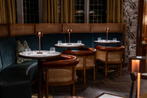
This section was key to the concept’s success, with everything else feeding off it. All additional furniture in the space was bespoke-made for the project by contractor Dawnvale, with twisted timber bases to the tables, which have a marble-effect top. The new seating throughout is both more contemporary and more of a statement with its mix of plain front fabrics in green (Papyrus from Ultrafabrics) and patterned fabric backs (Nouvelles Vagues from Dedar). Further tub chairs in ochre use a Madison Ginseng fabric from Sunbury Design, together with rattan backing, whilst a blue banquette in the window bay in the main restaurant area uses a Sunburst fabric, also from Sunbury Design, with a small rattan screen at the top on the banquette for a sense of privacy and screening.
Lighting was also key to creating intimacy. There are chargeable lamps on all the tables – a flexible, easily-moveable addition as they don’t need to be hard-wired – with focus placed on mood lighting at a smaller scale for each table. Additional lighting comes from floor standing lamps where needed – the Copenhagen SC14 from &Tradition.
The private dining space, which can also be seen from the hotel’s reception, features a large oval table with a black quartz top and a new lighting feature above it, set in front of the wine display, along with some smaller tables, set into the space’s bay window, so that inbuilt flexibility exists for main restaurant overflow at peak times.
A second major intervention is the new glazed areas for wine display and a meat-ageing fridge in the private dining area. Guests can also see the wine display element from the restaurant exterior, allowing inviting glimpses through into the space beyond. Views into the ‘theatre kitchen’, just beyond the private dining room, have also been maximised by the incorporation of new tiling in a deep bottle green / charcoal colour, pulling the eye through.


