The Lodge at Bodega Bay, a cherished coastal retreat along California’s Sonoma coastline, has undergone a stunning transformation. This reinvention, led by design and branding firm Superette Studio, beautifully blends coastal elegance with rustic charm, creating a visual identity that resonates with the natural beauty of Bodega Bay.
Family-owned and operated by Woodside Hospitality Group since the ‘70s, the boutique hotel, originally called Bodega Bay Lodge, grew and evolved into the premier destination in the region, serving a clientele that values timeless design and superior service.
Seeking to elevate the experience for longtime guests and welcome a new generation of travellers, romantics, and adventure seekers alike, Woodside Hospitality Group leaned on Superette’s expertise to redefine the property’s design identity. Spearheading the design and branding strategy, Superette redesigned the website, created collateral and other branding elements, and oversaw the interior design, custom furniture selection, and art direction for the refreshed property.
The design concept encompassed the 1,200-square-foot Captain’s Quarters and 7,200-square-foot guest rooms. Design elements blended the area’s rugged coastal surroundings with the community’s agricultural vernacular. A material palette composed of deep blues, earthy grays, and warm whites is layered with cerused oaks, forged iron metal, weathered stone, and relaxed linens, creating a physical material language for the property.
 Visual Identity
Redefining luxury while honouring the property’s coastal heritage, the Lodge’s bespoke visual identity is inspired by the migratory birds and scenic landscapes of Bodega Bay. Superette’s approach included a brand overhaul encompassing the logo and website and creating a variety of collateral that elevates the guest experience through meticulous attention to detail infused with rustic, romantic, and timeless charm.
The new custom primary logo typeface takes inspiration from the shapes of wings of the migratory birds that make this place their home. A secondary logo was created with the silhouette of a curlew perched on the marsh overlooking the region’s most scenic geographical feature, Bodega Head. The chosen typefaces for the brand, Sangbleu Versailles and Apercu Mono, live together to form a classic yet relaxed blend with a nod to the industrial fishing harbours that anchor the area.
A palette of moody coastal hues – harbour blues, sea greens, and driftwood browns – mingle with rustic kraft paper, rich leathers, and seagrass textures to keep guests connected to the natural world through every interaction. A series of commissioned illustrations by locally-based artist Steven Noble carry the sense of place beyond the property, peppering the website and other digital mediums with flora and fauna from around the coast – egrets, curlews, butterflies, hummingbirds, king salmon, cypress trees and marshes, to name a few. This suite allows endless creative combinations when designing print and digital pieces. Collateral is printed on recycled kraft and other environmentally friendly papers to keep in step with the property’s sustainability efforts.
A field guide was designed to showcase the abundance of possible activities and sights to see in the region and further connect guests to the outdoors and community. Pages featuring a bird watching checklist, Sonoma County wine tasting information, suggested day trip itineraries, and hand-illustrated maps are interspersed with touches of local history and lore and branded graphic elements. This signature piece acts as a guide for guests and becomes a souvenir after their trip is complete.
Superette also designed a series of retail products, extending the brand and inviting guests to interact with it during their stay. Designed to spark conversation about the region after the return home, graphic shirts showcase custom illustrations, while hats, backpacks, and other gear ideally suited to outdoor pursuits bear branded patches. Likewise, the brand extends beautifully to on-property amenity items such as custom bath products, chocolates, and other food items.
 Captain’s Quarters
At the heart of its redesign was The Lodge’s premiere suite, the Captain’s Quarters, which includes conference and meeting space and offers the most high-end guest suite experience on the Sonoma Coast.
The room presented a functional challenge. It had to operate in many roles: as a traditional guest suite, a corporate meeting room for up to 14 people, a bridal party suite for pre-wedding activities, a family suite, and a long-term stay suite. To accomplish this feat, Superette devised a flexible layout system for the property to move furniture setups to accommodate the various booking types easily.
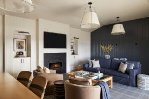
Accomplishing the design called for creating two new architectural features, giving the room symmetry around which the various floor plans could be arranged. The first major element was the addition of an energy-efficient gas fireplace flanked by built-in cabinet niches. Each niche houses custom filtered photography of the rugged coastline, framed and showcased under picture lights. This unit replaced a dated corner wood-burning fireplace and created a focal point along the room’s longest interior wall. Opposite the fireplace is a 14-foot sliding glass door system that opens to the large deck with bay views. When open, the doors expand the suite’s footprint and create additional living, dining, and conference space.
The second element was the design and creation of a hospitality unit. This newly constructed area includes a serving area, a bar, and a kitchenette. The center dining room table was custom designed and constructed from cerused oak to be able to expand and seat up to 14, with integrated power and data strategically located within the piece to coordinate with the multiple furniture arrangements. Opposite the hospitality unit, custom Murphy beds were added to create additional sleeping space.
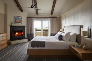
An unused bar area and closet were converted into an office with an added picture window to capture the serene waterview. The room is complete with a built-in desk and cozy seating nook. In the bedroom, a grand headboard spans the length of the wall in warm white paneling that extends to the ceiling and is flanked by floating nightstands in cerused oak with forged iron sconces. A subtle plaid carpet grounds the space and adds a coastal tone of grey-blue.
Building 6 Guest Rooms
To align The Lodge at Bodega Bay guest rooms with its new brand standards, Superette implemented an interior design scheme aimed at delivering a revitalized, refreshed, and timeless experience. The result nearly doubled the rooms’ average daily rate (ADR), achieving the pinnacle of high-end guest room experiences along the Sonoma Coast.
Each room boasts a grand headboard spanning a significant length of the wall, crafted in warm white paneling. The headboard rests above the mattress, upholstered in Parete vinyl with double-top stitch detail. Floating nightstands in cerused oak flank the beds on either side, accompanied by forged iron sconces, built-in switches, USB charging ports, and outlets. Discreet reading lights are nestled on either side of the vinyl headboard, featuring a seamless on/off design. A long lumbar pillow in a simple ikat Schumacher pattern complements organic wave-inspired throws from In2Green, adding pops of color against the crisp white bedding.
Instead of desks, custom café tables in a richly textured wire-brush finish and deep espresso stain are paired with swivel club chairs upholstered in rich taupe leather from Fil Doux, accented with contrasting navy leather welting. Casegoods, domestically crafted by Royal Custom Design in California, complete the ensemble.
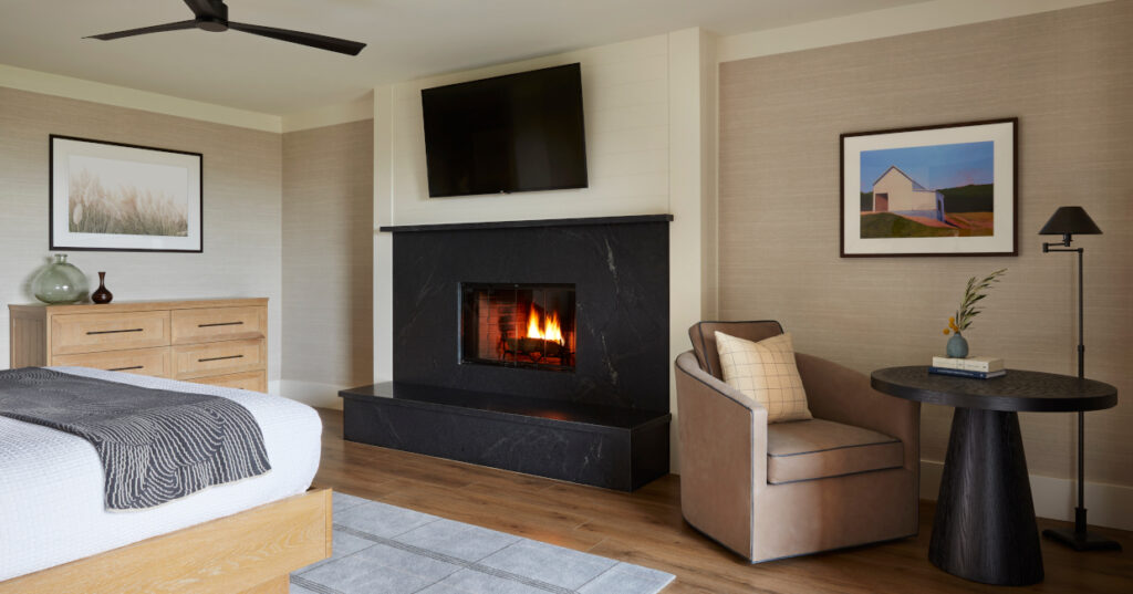
Walls are adorned with silk-inspired vinyl from Phillip Jeffries, enveloping the room in warmth and richness. Wood-burning fireplaces feature refreshed honed natural stone in grey-black tones, set against warm white V-groove paneling. Inspired by the region, wall art showcases paintings of agricultural structures and serene photography of grasses and marsh botanicals, evoking the coastal essence, with inspiration drawn from the works of Edward Hopper.
Weathered LVT in driftwood colour on the first floor is complemented by axminster area rugs from Oriental Weavers, featuring a custom plaid pattern in subtle grey tones. Upstairs, broadloom carpets from CM Hospitality match the downstairs rugs but boast a striped pattern, guiding guests toward the Bay views. Rich espresso-stained decorative beams adorn the upstairs ceilings, enhancing the height and infusing a sense of coziness and charm into the expansive spaces.


