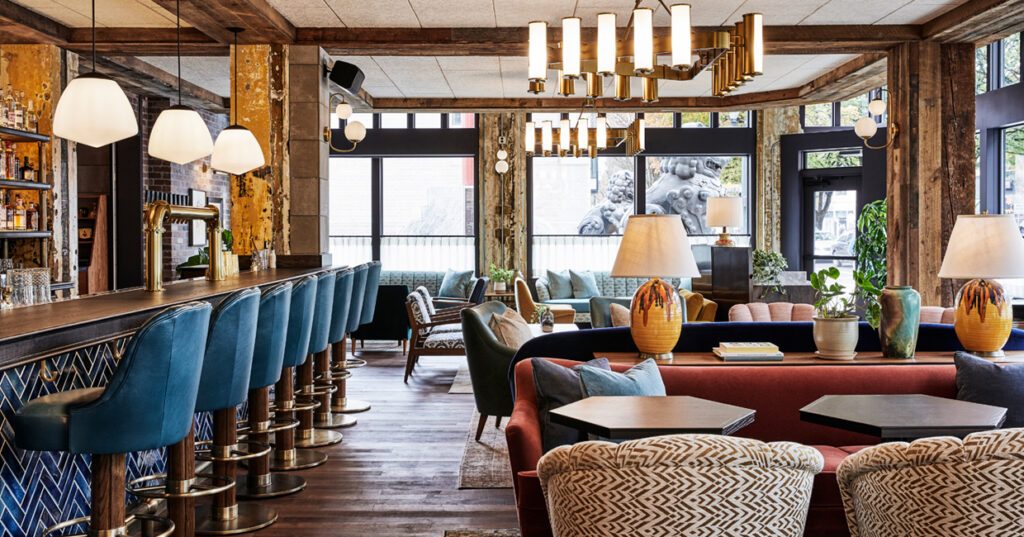
Fettle and Ennismore have worked in collaboration on the interiors of Hoxton’s sixth outpost – a remarkable former theatre in the Chinatown area of Portland.
Having worked with Ennismore on several projects in London, Fettle was familiar with the team’s style and working approach. This strong relationship was just as well, given the very tight parameters of the project.
“The main challenge was the timeline,” explains Andy Goodwin, co-founder of Fettle. “From starting the concept design all the way through to completion of install on-site totalled one year, which is remarkable for a project of this scale. It is testament to the strength of the construction team and our relationship with the team at Ennismore that this project was completed on time and within budget.”
Another key challenge for Fettle lay in conveying Hoxton’s unique design language, whilst adding original flair and location-specific design.
“Hoxton is obviously a well-established brand with outposts across London and Europe,” Andy continues. “The brand doesn’t necessarily have a specific design style, although there is a commonality that is apparent throughout their spaces.
“Our brief was to create the entrance lobby, coffee shop, bar, restaurant and apartment meeting room spaces within the hotel using the design language that they have within other sites, whilst ensuring that we make design decisions relevant to the building and its locality within Portland.”
Portland’s offbeat blend of gritty urban spaces and park culture offered plentiful inspiration for the hotel’s interior, but an equally rich canvas proved to be the building itself.
The older section of the building was a theatre in the 1920s, and boasts heavily-textured wooden columns, old plaster finishes and textured concrete. In complete contrast, the hotel’s lobby and accommodation sit within the adjacent new tower, complete with a striking glazed facade.
“The bar and restaurant which sit within the older part of the property are more traditional and rustic,” explains Fettle co-founder, Tom Parker. “We replicated some of the existing timber finishes found on the columns to develop the architectural details spanning both the ceiling and walls.
“The raised and fielded panelling in the restaurant is also an ode to the age of this part of the building. In the more modern lobby, the architectural details, namely particle board, are detailed in a more contemporary, clean fashion.”
“Portland’s offbeat blend of gritty urban spaces and park culture offered plentiful inspiration for the hotel’s interior, but an equally rich canvas proved to be the building itself”
Hoxton is known for the seamless flow of its public spaces, and the Hoxton Portland is no different in this regard. The lobby is open, comfortable and inclusive and style, designed as a community hub for locals and hotel guests alike.
A geometric blackened steel reception desk acts as the anchoring element here, but the true focal point is an expansive brick wall with an integrated central fireplace. An assortment of mid-century inspired furniture, upholstered in colourful and comfortable fabrics, is orientated around the hearth.
“Furniture-wise the scheme has a European style with a mid-century influence,” explains Tom. “We designed a vast number of bespoke pieces for this project, but we also used vintage shops across Portland such as Vintage Pink, and had all found items reupholstered by the fantastic Acanthus Upholstery in north Portland. The richly upholstered furniture and bold array of fabrics provided a great contrast against the more rustic and linear architectural details.”
“The furniture is a core part of the design scheme but the boldest element of the FFE is the lighting,” he continues. “All of the pendants in the space are bespoke and were specifically designed for this project and made by Lusive Decor in Los Angeles. They are 1930s and 40s inspired and detailed to give a warm, diffused glow.”
The striking custom-designed pendant lights join Armstrong’s Tectum range for the ceiling. These specialist wood wool panels have a heavily textured, modern feel, as well as strong acoustic properties. Made from old timber, the team chose a complementary colour for the interiors, settling on Bella Pink.
The bar and restaurant spaces sit to the front, surrounded on two sides the full height glazing of the existing facade. Reclaimed timber flooring, sourced locally from Pioneer Millworks, runs through from the lobby.
A blue herringbone tiled bar front, complete with brass back bar, internally illuminated shelves and an antiqued mirror back, acts as the centrepiece of the property’s older section.
The hotel’s restaurant, La Neta, is located at the other end of the room and is surrounded by walls clad in dark painted timber panelling, scattered by Latin-inspired artwork curated by local art consultant Upfor Gallery.
Simple freestanding banquettes, upholstered in aged green leather, have been paired with timber and tan leather chairs and oak dining tables. A bespoke black, white and gold patterned floor tile differentiates the restaurant from the bar space.
Lastly, the 119 rooms have been cleverly designed to make the best use of the space available. Ranging from Shoebox through to Roomy, the accommodation is awash with rich walnut panelling and mid-century touches, alongside artwork selected by Upfor, ceramics by Clay Factor and bookshelves curated by Hox Friends.
The overall feeling at the Hoxton Portland is one of warmth and comfort, achieved through the artful layering of assorted textured materials, bespoke furniture and lighting designs. The property’s unique clash of old and new ultimately chimes perfectly with the Hoxton philosophy, creating a fitting communal hub for Portland travellers and residents.


